## Introduction to Pipeline Diagrams Ever tried to explain a multi-step process to your team, only to be met with blank stares or confusion? Sounds complex, right? That’s where a **pipeline diagram** comes in. Imagine having a visual map that lays out every stage of your workflow—whether you’re moving data, deploying software, or managing operations. Suddenly, those complex steps become clear, and everyone is on the same page. ### What Is a Pipeline Diagram? A pipeline diagram is a visual representation that breaks down a process into distinct stages or steps, showing how information, tasks, or materials flow from one point to another. You’ll notice these diagrams everywhere—from software engineering, where they map out code deployment, to data management, where they track data ingestion, transformation, and delivery. Even in operational workflows, pipeline diagrams help teams visualize how work progresses, identify bottlenecks, and optimize efficiency. * **Software Engineering:** Visualizes code movement from development to production. * **Data Management:** Tracks data as it flows from source to storage to analysis. * **Operations:** Outlines step-by-step task progression in business processes. ### Why Use Pipeline Diagrams? Still wondering if you need one? Here are the core benefits: * **Clarity:** Complex workflows become easy to understand at a glance. * **Improved Team Communication:** Everyone shares a common visual language, reducing misunderstandings. * **Streamlined Troubleshooting:** Pinpoint issues faster by seeing exactly where things might go wrong. For example, a **pipeline diagram example** in data management might show how raw data is collected, cleaned, transformed, and then loaded into a dashboard for business analysis. Each stage is clearly labeled, with arrows showing the flow—making it easy for both technical and non-technical team members to follow along. ### What’s Ahead in This Guide? This article will guide you through the fundamentals of pipeline visualization, explore real-world examples from software delivery and data processing, and share best practices for designing effective diagrams. You’ll see how pipeline diagrams can be tailored for different domains—whether you’re building a CI/CD pipeline for software, mapping out a data pipeline for analytics, or orchestrating complex operational workflows. By the end, you’ll understand how to leverage pipeline diagrams to bring clarity, efficiency, and collaboration to your most complex projects. Ready to visualize your workflow? Let’s dive in. 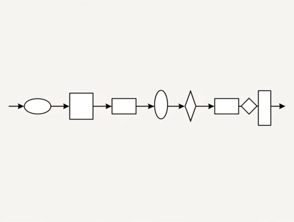 ## The Fundamentals of Pipeline Visualization When you first look at a **diagram of pipeline**, it might seem like a maze of shapes, arrows, and labels. But once you break it down, you’ll notice a universal logic at work—one that brings order to even the most complex workflows. So, how do you read and create these diagrams with confidence? ### Core Components of a Pipeline Diagram Imagine mapping out a process from start to finish. Every pipeline diagram, no matter the industry, relies on a few foundational elements: * **Stages:** These are the major steps or phases in your process—think of them as milestones on your workflow map. * **Tasks:** The specific actions or operations within each stage. Tasks break down stages into manageable chunks. * **Data Flow:** Arrows or lines that show how information, materials, or actions move from one task or stage to the next. * **Decision Points:** Diamonds or other symbols that indicate choices or branching paths in the process. By combining these components, a pipeline diagram visually narrates the journey from input to output, making it easy to spot dependencies, loops, and potential bottlenecks. ### Common Pipeline Diagram Symbols and Their Meanings Just like a map uses icons for landmarks, pipeline diagrams use standardized symbols to represent equipment, actions, and connections. In industrial contexts, these are often referred to as P&ID (Piping and Instrumentation Diagram) symbols. Here’s a quick reference to some of the most widely used symbols, inspired by [industry standards](https://www.edrawmax.com/article/p-and-id-symbols.html): |Rectangle|Stage or Process Step|Represents a main phase or operation| |---|---|---| |Oval|Start/End Point|Indicates where the process begins or ends| |Arrow|Data/Process Flow|Shows direction of movement| |Diamond|Decision Point|Marks a choice or branching logic| |Circle|Connector/Reference|Links different parts of the diagram| |Specialized Icons|Pumps, Valves, Sensors, etc.|Used in industrial or data flow diagrams for specific equipment or actions| For more technical or industry-specific diagrams, you’ll encounter symbols for actuators, vessels, compressors, heat exchangers, and more. These **pipeline diagram symbols** are standardized to ensure everyone—from engineers to analysts—speaks the same visual language ([EdrawMax](https://www.edrawmax.com/article/p-and-id-symbols.html)). ### Best Practices for Clear and Readable Pipeline Diagrams Ever tried to follow a diagram that’s cluttered or confusing? It’s frustrating. Here are some proven tips to make your diagrams clear and actionable: * **Keep it Simple:** Use only essential symbols. Too many shapes can overwhelm the reader. * **Label Everything:** Clearly mark each stage, task, and decision point. If you’re using specialized symbols, include a legend. * **Consistent Direction:** Arrange flows from left-to-right or top-to-bottom to match natural reading patterns. * **Group Related Steps:** Visually cluster tasks that belong together, making the diagram easier to scan. * **Use Color Sparingly:** Highlight key paths or exceptions, but avoid distracting color schemes. Whether you’re designing a high-level overview or a detailed technical **diagram of pipeline**, these principles help ensure your visual stays readable and useful for everyone involved. ### Different Ways to Represent a Pipeline Not all pipelines look the same. Some are linear, showing a straight path from start to finish. Others branch, loop, or merge, reflecting complex real-world logic. For instance: * **Linear Pipelines:** Ideal for straightforward processes with clear start and end points. * **Branched Pipelines:** Useful when decisions or parallel tasks are involved. * **Circular or Feedback Loops:** Represent iterative processes or quality checks. Choosing the right layout depends on your process and your audience. A well-structured pipeline diagram not only clarifies the workflow but also sets the stage for deeper dives—such as mapping out software delivery or data processing pipelines, which we’ll explore next. ## Streamlining Delivery with CI/CD Pipeline Diagrams When you hear the phrase “automated software delivery,” does it sound a little mysterious? If you’ve ever wondered how top-performing teams ship updates quickly and with fewer errors, the answer often lies in a well-designed **ci cd pipeline diagram**. This visual map breaks down the entire process—from writing code to releasing it live—making every step transparent and manageable. ### What Is a CI/CD Pipeline Diagram? At its core, a **ci/cd pipeline diagram** is a visual representation of the automated steps that move software changes from development all the way to production. Think of it as a roadmap that shows how code travels through various checks, tests, and approvals, ensuring only high-quality updates make it to your users ([MyMap.AI](https://www.mymap.ai/template/ci-cd-diagram)). These diagrams are invaluable for documenting and communicating complex DevOps processes. By outlining each stage—like code commit, build, test, and deploy—they help teams identify bottlenecks, streamline workflows, and foster a shared understanding of responsibilities. Imagine being able to pinpoint exactly where a delay is happening, or quickly explain your process to a new team member. That’s the power of a **cicd pipeline diagram**. ### Key Stages of the CI/CD Pipeline Let’s break down the typical stages you’ll find in a CI/CD pipeline diagram. Each stage is a critical checkpoint on the journey from code to customer: * **Code Commit & Version Control:** Developers write code and commit it to a shared repository (like Git). This ensures every change is tracked and can be rolled back if needed ([Zeet](https://zeet.co/blog/cicd-pipeline-stages)). * **Build & Compilation:** The pipeline automatically fetches the latest code and compiles it into a deployable artifact, such as a binary or container image. Tools like Maven, Gradle, or Docker are often used here. * **Automated Testing:** Comprehensive tests—unit, integration, and end-to-end—are executed to catch bugs or regressions early. This stage is vital for maintaining software quality and reliability. * **Code Quality Analysis:** Static analysis tools (like SonarQube or ESLint) check for code smells, duplication, and adherence to best practices. * **Artifact Packaging:** The successfully built and tested code is packaged for deployment, ensuring consistency across environments. * **Deployment:** The artifact is automatically deployed to a staging or production environment. Orchestration tools such as Kubernetes or Jenkins help automate this process. * **Monitoring & Feedback:** After deployment, monitoring tools track application performance and user feedback, enabling rapid response to issues and continuous improvement. By visualizing these stages in a pipeline diagram, teams can quickly spot inefficiencies, reduce manual errors, and accelerate release cycles. For example, if a test consistently fails, you’ll see exactly where in the process the issue occurs, making troubleshooting much more straightforward. ### Why Visualizing CI/CD Pipelines Matters * **Accelerates Development Cycles:** A clear diagram can help reduce development time by up to 50% by making bottlenecks and redundant steps visible ([MyMap.AI](https://www.mymap.ai/template/ci-cd-diagram)). * **Improves Team Collaboration:** Shared visuals align everyone on process steps and responsibilities, reducing misunderstandings and errors. * **Enhances Pipeline Visibility:** Tracking code as it moves through each stage helps teams resolve issues faster and ensures more stable deployments. * **Facilitates Continuous Improvement:** With a baseline diagram, you can regularly review and refine your pipeline, reducing deployment failures over time. ### Variations and Common CI/CD Tools You might see the term written as **ci cd pipeline diagram**, **ci/cd pipeline diagram**, or **cicd pipeline diagram**—they all refer to the same concept. The specific tools visualized in these diagrams may vary, but commonly include: * Jenkins * GitLab CI/CD * CircleCI * Travis CI * Azure DevOps * GitHub Actions * Bamboo * TeamCity Each tool automates different parts of the pipeline, but the overall flow—from code commit to deployment—remains consistent. Visualizing these tools and their integrations within the pipeline diagram makes it easier to manage, optimize, and scale your delivery process. Curious about how these automation pipelines fit within broader DevOps and cloud workflows? Next, we’ll explore how pipeline diagrams map out end-to-end development and operations lifecycles, including cloud-native and security-focused scenarios.  ## Charting DevOps and Cloud Platform Workflows Ever wondered how leading tech teams keep development, testing, security, and deployment running like a well-oiled machine? That’s the power of a **devops pipeline diagram**. Let’s break down how these diagrams map out the entire software lifecycle, integrate security, and adapt to cloud platforms like AWS and Azure. ### DevOps Pipeline Diagrams: Orchestrating End-to-End Software Delivery When you picture a modern software project, imagine a relay race—each stage hands off to the next, but everyone needs to know the route. A **devops pipeline diagram** visually represents this journey, capturing every step from coding to deployment and ongoing operations. These diagrams typically include: * **Continuous Integration (CI):** Developers merge code into a shared repository, triggering automated builds and tests. * **Continuous Testing:** Automated tests (unit, integration, regression) run to catch issues early. * **Continuous Delivery/Deployment (CD):** Successfully tested code is automatically packaged and deployed to production or staging environments. * **Continuous Feedback:** Monitoring tools feed insights back to the team, driving improvements and rapid response to issues. * **Continuous Operations:** Ongoing management, scaling, and monitoring of applications in production. By mapping these stages, teams gain a clear checklist of tools, environments, and responsibilities—helping everyone stay aligned and reducing the risk of missed steps or bottlenecks. This transparency is especially vital in large organizations with multiple teams and environments ([KnowledgeHut](https://www.knowledgehut.com/blog/devops/devops-pipeline-diagram)). ### Integrating Security: The DevSecOps Pipeline Diagram Security isn’t an afterthought—it’s woven into every stage. Enter the **DevSecOps pipeline diagram**, which bakes security checks directly into the DevOps flow. Picture these added checkpoints: * **Secure Design:** Early collaboration between developers and security engineers to choose secure architectures and features. * **Automated Code Scanning:** Detect vulnerabilities during the coding and integration phase using tools for static analysis (SAST). * **Security Testing:** Dynamic scans (DAST) and vulnerability assessments after builds and in test environments. * **Production Monitoring:** Continuous runtime monitoring for threats or unusual behavior. By integrating these controls, organizations "shift security left," catching issues earlier and minimizing the risk of vulnerabilities reaching production. This fosters true collaboration between development, operations, and security teams, streamlining releases without sacrificing safety ([AquaSec](https://www.aquasec.com/cloud-native-academy/devsecops/devsecops-pipeline/)). ### Cloud-Native Pipelines: AWS and Azure DevOps Pipeline Diagrams As more teams move to the cloud, pipeline diagrams must adapt to new tools and architectures. Two of the most popular cloud-native CI/CD platforms are AWS CodePipeline and Azure DevOps. Each platform offers unique capabilities, integrations, and user experiences: * **AWS CodePipeline:** Seamlessly integrates with AWS services (CodeBuild, CodeDeploy, CodeCommit), ideal for teams already invested in the AWS ecosystem. * **Azure DevOps:** Provides a comprehensive suite for project management, version control, automated builds, and deployments—plus an intuitive drag-and-drop pipeline builder.
{ "id": "hNXCNhkBpG", "cover": "https://affine-reader.vercel.app/api/workspaces/qf73AF6vzWphbTJdN7KiX/blobs/a0TKbLywUMbtLI3fHHlEYtFK-TtEY-Z4jcB6EE_GI6Q=", "coverAlt": "", "title": "Master Pipeline Diagrams: Visualize Complex Workflows Instantly", "createDate": 1747997509256, "tags": [ "Content" ], "updatedDate": 1747997556677, "trash": true, "trashDate": 1748001813922, "guid": "hNXCNhkBpG", "properties": { "id": "hNXCNhkBpG", "edgelessColorTheme": "dark", "tags": [] }, "author": "Allen", "slug": "pipeline-diagram", "description": "Master pipeline diagrams with practical examples and templates. Visualize workflows in software, data, and AI for clarity, troubleshooting, and efficiency.", "created": 1747699200000, "updated": 1747958400000, "layout": "blog", "publish": true, "authors": [ "Allen" ], "valid": true, "relatedBlogIds": [], "linkedPageIds": [], "relatedBlogs": [] }valid
Introduction to Pipeline Diagrams
Ever tried to explain a multi-step process to your team, only to be met with blank stares or confusion? Sounds complex, right? That’s where a pipeline diagram comes in. Imagine having a visual map that lays out every stage of your workflow—whether you’re moving data, deploying software, or managing operations. Suddenly, those complex steps become clear, and everyone is on the same page.
What Is a Pipeline Diagram?
A pipeline diagram is a visual representation that breaks down a process into distinct stages or steps, showing how information, tasks, or materials flow from one point to another. You’ll notice these diagrams everywhere—from software engineering, where they map out code deployment, to data management, where they track data ingestion, transformation, and delivery. Even in operational workflows, pipeline diagrams help teams visualize how work progresses, identify bottlenecks, and optimize efficiency.
-
Software Engineering: Visualizes code movement from development to production.
-
Data Management: Tracks data as it flows from source to storage to analysis.
-
Operations: Outlines step-by-step task progression in business processes.
Why Use Pipeline Diagrams?
Still wondering if you need one? Here are the core benefits:
-
Clarity: Complex workflows become easy to understand at a glance.
-
Improved Team Communication: Everyone shares a common visual language, reducing misunderstandings.
-
Streamlined Troubleshooting: Pinpoint issues faster by seeing exactly where things might go wrong.
For example, a pipeline diagram example in data management might show how raw data is collected, cleaned, transformed, and then loaded into a dashboard for business analysis. Each stage is clearly labeled, with arrows showing the flow—making it easy for both technical and non-technical team members to follow along.
What’s Ahead in This Guide?
This article will guide you through the fundamentals of pipeline visualization, explore real-world examples from software delivery and data processing, and share best practices for designing effective diagrams. You’ll see how pipeline diagrams can be tailored for different domains—whether you’re building a CI/CD pipeline for software, mapping out a data pipeline for analytics, or orchestrating complex operational workflows.
By the end, you’ll understand how to leverage pipeline diagrams to bring clarity, efficiency, and collaboration to your most complex projects. Ready to visualize your workflow? Let’s dive in.
The Fundamentals of Pipeline Visualization
When you first look at a diagram of pipeline, it might seem like a maze of shapes, arrows, and labels. But once you break it down, you’ll notice a universal logic at work—one that brings order to even the most complex workflows. So, how do you read and create these diagrams with confidence?
Core Components of a Pipeline Diagram
Imagine mapping out a process from start to finish. Every pipeline diagram, no matter the industry, relies on a few foundational elements:
-
Stages: These are the major steps or phases in your process—think of them as milestones on your workflow map.
-
Tasks: The specific actions or operations within each stage. Tasks break down stages into manageable chunks.
-
Data Flow: Arrows or lines that show how information, materials, or actions move from one task or stage to the next.
-
Decision Points: Diamonds or other symbols that indicate choices or branching paths in the process.
By combining these components, a pipeline diagram visually narrates the journey from input to output, making it easy to spot dependencies, loops, and potential bottlenecks.
Common Pipeline Diagram Symbols and Their Meanings
Just like a map uses icons for landmarks, pipeline diagrams use standardized symbols to represent equipment, actions, and connections. In industrial contexts, these are often referred to as P&ID (Piping and Instrumentation Diagram) symbols. Here’s a quick reference to some of the most widely used symbols, inspired by industry standards:
| Rectangle | Stage or Process Step | Represents a main phase or operation |
|---|---|---|
| Oval | Start/End Point | Indicates where the process begins or ends |
| Arrow | Data/Process Flow | Shows direction of movement |
| Diamond | Decision Point | Marks a choice or branching logic |
| Circle | Connector/Reference | Links different parts of the diagram |
| Specialized Icons | Pumps, Valves, Sensors, etc. | Used in industrial or data flow diagrams for specific equipment or actions |
For more technical or industry-specific diagrams, you’ll encounter symbols for actuators, vessels, compressors, heat exchangers, and more. These pipeline diagram symbols are standardized to ensure everyone—from engineers to analysts—speaks the same visual language (EdrawMax).
Best Practices for Clear and Readable Pipeline Diagrams
Ever tried to follow a diagram that’s cluttered or confusing? It’s frustrating. Here are some proven tips to make your diagrams clear and actionable:
-
Keep it Simple: Use only essential symbols. Too many shapes can overwhelm the reader.
-
Label Everything: Clearly mark each stage, task, and decision point. If you’re using specialized symbols, include a legend.
-
Consistent Direction: Arrange flows from left-to-right or top-to-bottom to match natural reading patterns.
-
Group Related Steps: Visually cluster tasks that belong together, making the diagram easier to scan.
-
Use Color Sparingly: Highlight key paths or exceptions, but avoid distracting color schemes.
Whether you’re designing a high-level overview or a detailed technical diagram of pipeline, these principles help ensure your visual stays readable and useful for everyone involved.
Different Ways to Represent a Pipeline
Not all pipelines look the same. Some are linear, showing a straight path from start to finish. Others branch, loop, or merge, reflecting complex real-world logic. For instance:
-
Linear Pipelines: Ideal for straightforward processes with clear start and end points.
-
Branched Pipelines: Useful when decisions or parallel tasks are involved.
-
Circular or Feedback Loops: Represent iterative processes or quality checks.
Choosing the right layout depends on your process and your audience. A well-structured pipeline diagram not only clarifies the workflow but also sets the stage for deeper dives—such as mapping out software delivery or data processing pipelines, which we’ll explore next.
Streamlining Delivery with CI/CD Pipeline Diagrams
When you hear the phrase “automated software delivery,” does it sound a little mysterious? If you’ve ever wondered how top-performing teams ship updates quickly and with fewer errors, the answer often lies in a well-designed ci cd pipeline diagram. This visual map breaks down the entire process—from writing code to releasing it live—making every step transparent and manageable.
What Is a CI/CD Pipeline Diagram?
At its core, a ci/cd pipeline diagram is a visual representation of the automated steps that move software changes from development all the way to production. Think of it as a roadmap that shows how code travels through various checks, tests, and approvals, ensuring only high-quality updates make it to your users (MyMap.AI).
These diagrams are invaluable for documenting and communicating complex DevOps processes. By outlining each stage—like code commit, build, test, and deploy—they help teams identify bottlenecks, streamline workflows, and foster a shared understanding of responsibilities. Imagine being able to pinpoint exactly where a delay is happening, or quickly explain your process to a new team member. That’s the power of a cicd pipeline diagram.
Key Stages of the CI/CD Pipeline
Let’s break down the typical stages you’ll find in a CI/CD pipeline diagram. Each stage is a critical checkpoint on the journey from code to customer:
-
Code Commit & Version Control: Developers write code and commit it to a shared repository (like Git). This ensures every change is tracked and can be rolled back if needed (Zeet).
-
Build & Compilation: The pipeline automatically fetches the latest code and compiles it into a deployable artifact, such as a binary or container image. Tools like Maven, Gradle, or Docker are often used here.
-
Automated Testing: Comprehensive tests—unit, integration, and end-to-end—are executed to catch bugs or regressions early. This stage is vital for maintaining software quality and reliability.
-
Code Quality Analysis: Static analysis tools (like SonarQube or ESLint) check for code smells, duplication, and adherence to best practices.
-
Artifact Packaging: The successfully built and tested code is packaged for deployment, ensuring consistency across environments.
-
Deployment: The artifact is automatically deployed to a staging or production environment. Orchestration tools such as Kubernetes or Jenkins help automate this process.
-
Monitoring & Feedback: After deployment, monitoring tools track application performance and user feedback, enabling rapid response to issues and continuous improvement.
By visualizing these stages in a pipeline diagram, teams can quickly spot inefficiencies, reduce manual errors, and accelerate release cycles. For example, if a test consistently fails, you’ll see exactly where in the process the issue occurs, making troubleshooting much more straightforward.
Why Visualizing CI/CD Pipelines Matters
-
Accelerates Development Cycles: A clear diagram can help reduce development time by up to 50% by making bottlenecks and redundant steps visible (MyMap.AI).
-
Improves Team Collaboration: Shared visuals align everyone on process steps and responsibilities, reducing misunderstandings and errors.
-
Enhances Pipeline Visibility: Tracking code as it moves through each stage helps teams resolve issues faster and ensures more stable deployments.
-
Facilitates Continuous Improvement: With a baseline diagram, you can regularly review and refine your pipeline, reducing deployment failures over time.
Variations and Common CI/CD Tools
You might see the term written as ci cd pipeline diagram, ci/cd pipeline diagram, or cicd pipeline diagram—they all refer to the same concept. The specific tools visualized in these diagrams may vary, but commonly include:
-
Jenkins
-
GitLab CI/CD
-
CircleCI
-
Travis CI
-
Azure DevOps
-
GitHub Actions
-
Bamboo
-
TeamCity
Each tool automates different parts of the pipeline, but the overall flow—from code commit to deployment—remains consistent. Visualizing these tools and their integrations within the pipeline diagram makes it easier to manage, optimize, and scale your delivery process.
Curious about how these automation pipelines fit within broader DevOps and cloud workflows? Next, we’ll explore how pipeline diagrams map out end-to-end development and operations lifecycles, including cloud-native and security-focused scenarios.
Charting DevOps and Cloud Platform Workflows
Ever wondered how leading tech teams keep development, testing, security, and deployment running like a well-oiled machine? That’s the power of a devops pipeline diagram. Let’s break down how these diagrams map out the entire software lifecycle, integrate security, and adapt to cloud platforms like AWS and Azure.
DevOps Pipeline Diagrams: Orchestrating End-to-End Software Delivery
When you picture a modern software project, imagine a relay race—each stage hands off to the next, but everyone needs to know the route. A devops pipeline diagram visually represents this journey, capturing every step from coding to deployment and ongoing operations. These diagrams typically include:
-
Continuous Integration (CI): Developers merge code into a shared repository, triggering automated builds and tests.
-
Continuous Testing: Automated tests (unit, integration, regression) run to catch issues early.
-
Continuous Delivery/Deployment (CD): Successfully tested code is automatically packaged and deployed to production or staging environments.
-
Continuous Feedback: Monitoring tools feed insights back to the team, driving improvements and rapid response to issues.
-
Continuous Operations: Ongoing management, scaling, and monitoring of applications in production.
By mapping these stages, teams gain a clear checklist of tools, environments, and responsibilities—helping everyone stay aligned and reducing the risk of missed steps or bottlenecks. This transparency is especially vital in large organizations with multiple teams and environments (KnowledgeHut).
Integrating Security: The DevSecOps Pipeline Diagram
Security isn’t an afterthought—it’s woven into every stage. Enter the DevSecOps pipeline diagram, which bakes security checks directly into the DevOps flow. Picture these added checkpoints:
-
Secure Design: Early collaboration between developers and security engineers to choose secure architectures and features.
-
Automated Code Scanning: Detect vulnerabilities during the coding and integration phase using tools for static analysis (SAST).
-
Security Testing: Dynamic scans (DAST) and vulnerability assessments after builds and in test environments.
-
Production Monitoring: Continuous runtime monitoring for threats or unusual behavior.
By integrating these controls, organizations "shift security left," catching issues earlier and minimizing the risk of vulnerabilities reaching production. This fosters true collaboration between development, operations, and security teams, streamlining releases without sacrificing safety (AquaSec).
Cloud-Native Pipelines: AWS and Azure DevOps Pipeline Diagrams
As more teams move to the cloud, pipeline diagrams must adapt to new tools and architectures. Two of the most popular cloud-native CI/CD platforms are AWS CodePipeline and Azure DevOps. Each platform offers unique capabilities, integrations, and user experiences:
-
AWS CodePipeline: Seamlessly integrates with AWS services (CodeBuild, CodeDeploy, CodeCommit), ideal for teams already invested in the AWS ecosystem.
-
Azure DevOps: Provides a comprehensive suite for project management, version control, automated builds, and deployments—plus an intuitive drag-and-drop pipeline builder.